A well-structured Figma workspace saves time and improves the quality of web designs. Discover a practical method to accelerate your creative workflow.
Source video: brice.web
In a context where every minute counts for digital teams, how you organize your workspace on tools like Figma can radically transform productivity. Designers and web developers in Quebec, especially in Mauricie, strive to move fast without sacrificing quality or project consistency.
Too often, time is wasted searching for inspirations, assets, or navigating between scattered files. This fragmented time accumulates and slows project delivery, directly impacting client satisfaction and the company’s competitiveness.
The Pitfall of a Disorganized Workspace
Without a clear framework, designers juggle scattered inspirations, poorly defined colors, and multiple fonts, which slows progress. The lack of a visually accessible structure with one click forces constant back-and-forths that fragment focus.
This confusion affects deadlines, quality, and client perception, with an obvious risk: losing contracts to more agile competitors. Naive approaches that involve accumulating resources without method only worsen the situation.
Structuring Your Workspace to Speed Up and Ensure Reliability
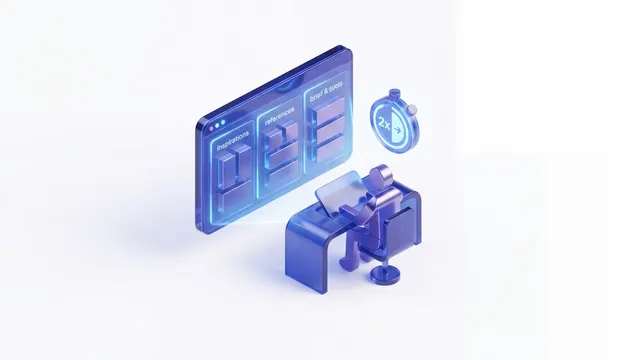
The solution is to create a simple and efficient Figma workspace, organized into clear and functional zones. On the left, an inspiration grid gathers all projects that fuel creativity, visible at a glance. Next to it, a space reserved for competitor visuals allows quick comparison and adjustment of the strategy design.
On the right, the client brief, texts to integrate, and tools such as images are grouped into dedicated grids, avoiding any time loss. Regarding the palette, it is intentionally limited to four main colors — primary, dark, light, secondary — and one to two fonts are chosen to ensure clarity and consistency.
Finally, starting with a frame adapted to a small screen — for example, a 14-inch MacBook — facilitates scaling up to larger screens, avoiding complex adjustments downstream.
This simple yet rigorous organization doubles design speed, improves quality, and reduces unnecessary back-and-forths. It’s a concrete lever for agencies and companies wanting to transform their digital presence quickly and efficiently.
Umbeli supports its clients in Mauricie and Quebec in implementing optimized workflows, combining UX/UI design and custom web development. For a digital project that moves at the right pace, start by structuring your workspace: it’s the foundation of a solid and efficient process.
We recommend a 1-hour analysis workshop at CA$175 (~€120) to precisely frame these optimizations. Move from intention to action with Umbeli, your premium digital partner.
Cited Resources
Figma (agency) - Umbeli page presenting the agency, its roots in Mauricie, and its way of supporting Quebec companies.
ui (service) - Umbeli service that deepens this concept from the user experience, UX/UI design, and product clarity perspective.
analysis (service) - Umbeli service directly related to the topic discussed in the article.
ai (service) - Umbeli service most relevant for turning this topic into concrete workflows, automation, or useful AI usage.
web development (service) - Umbeli service directly related to the topic discussed in the article.
How Mastering Custom Web Development Opens the Path to Financial Freedom in 2023 (article) - Related Umbeli article that explores a topic close to the one discussed.
How AI is Transforming Custom Web Development: The Concrete Example of an Expert Developer (article) - Related Umbeli article that explores a topic close to the one discussed.
Gain 10 Hours per Week Thanks to Automation and AI: The Concrete Example of a Digital Agency (article) - Related Umbeli article that explores a topic close to the one discussed.
Three Essential Rules for Mobile Design That Converts: The Reprice Case (article) - Umbeli article also covering UX/UI Design.
Why UX/UI Design Remains the Key Human Skill Against AI in Web Development (article) - Umbeli article also covering Web Development.
Take the next step
Want to implement this in your business?
This topic directly connects to Branding & UX/UI. We can help you turn it into a concrete, useful and profitable system for your business.